| Animal | Length | Height | |
|---|---|---|---|
| 112 | Kangaroo | 1.568641 | 1.843209 |
| 66 | Giraffe | 3.132013 | 5.483761 |
| 6 | Lion | 2.680548 | 1.454220 |
| 14 | Lion | 2.315484 | 1.167234 |
| 31 | Tiger | 2.779660 | 1.028793 |
| 139 | Koala | 0.661594 | 0.636471 |
| 10 | Lion | 2.308350 | 0.938822 |
| 84 | Zebra | 2.120716 | 1.324181 |
Forelesningsnotat – Obligatorisk oppgave
Titanic

I filmen om titanic-forliset følger overlevelsen det mønsteret man godt kunne tenke seg. Kvinner på første klasse overlever, og menn på tredje klasse dør. Hvem hvor godt klarer vi å bruke det vi vet om en passaser til å predikere om vedkommende kommer til å overleve titanic-forliset? og kan vi bruke en slik modell til å forstå noe om hvordan de forskjellige egenskapene til en person, slik som kjønn, alder og pris på billetten, påvirker overlevelsen ved et forlis?
Men før det
- Høyde og lengde på forskjellige dyr
Vi har laget oss et datasett med lengde- og høydedata om forskjellige dyr. Det kan lastes ned her.
Plot
import matplotlib.pyplot as plt
# Load the dataset from the CSV file
animal_data = pd.read_csv('data/animal_data.csv')
plt.figure(figsize=(8, 5))
plt.plot(animal_data["Length"], animal_data["Height"], "o")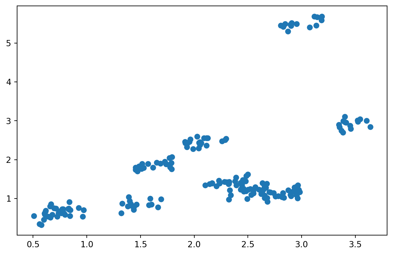
Med navn på dyrene
# Lage scatter-plot fordelt på dyr
plt.figure(figsize=(8, 5))
for animal in animal_data['Animal'].unique():
    subset = animal_data[animal_data['Animal'] == animal]
    plt.scatter(subset['Length'], subset['Height'], label=animal)

# Pynt
plt.title('Animal Length vs Height')
plt.xlabel('Length (m)')
plt.ylabel('Height (m)')
plt.legend(title='Animal')
plt.show()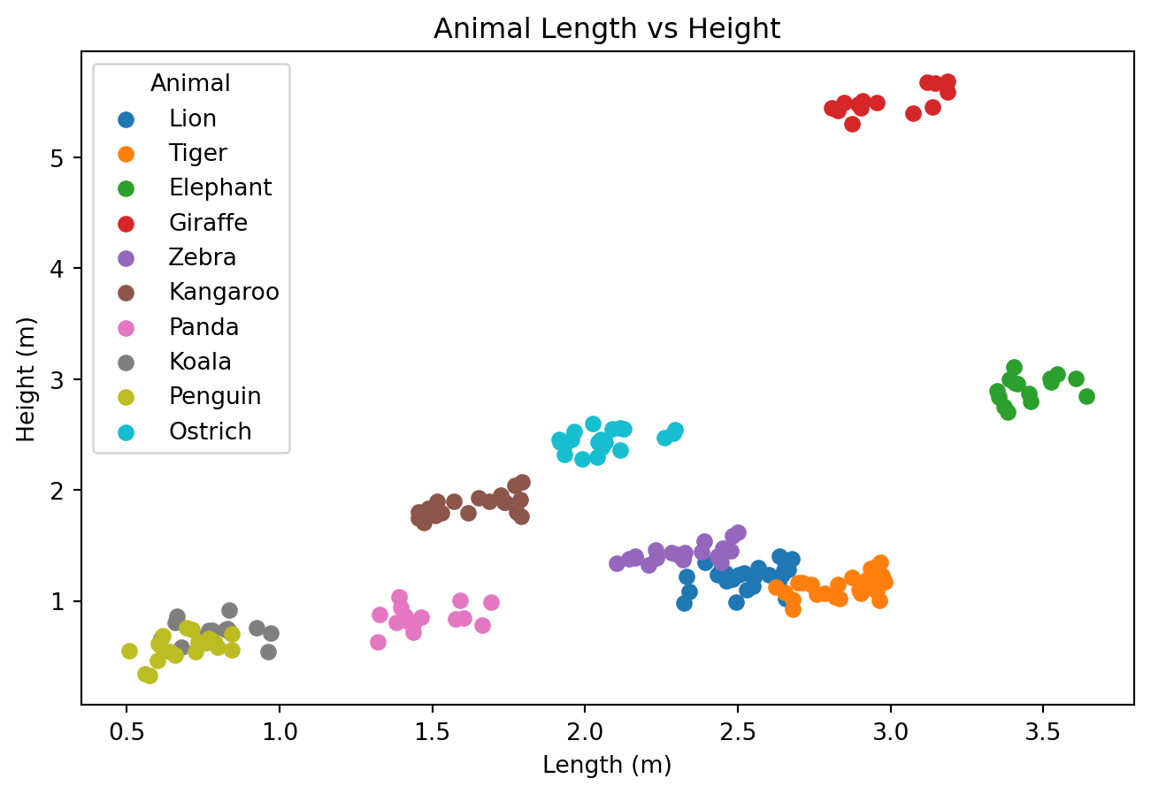
Envariabel lineær regresjon
from sklearn.linear_model import LinearRegression

# Prepare the data for linear regression
X = animal_data[['Length']]
y = animal_data['Height']

# Create and fit the model
model = LinearRegression()
model.fit(X, y)

# Predict the heights using the model
predicted_heights = model.predict(X)

# Plot the original data and the linear regression model
plt.figure(figsize=(8, 5))
plt.scatter(animal_data['Length'], animal_data['Height'], label='Actual Data')
plt.plot(animal_data['Length'], predicted_heights, color='red', label='Linear Regression Model')

# Add labels and title
plt.title('Linear Regression: Animal Length vs Height')
plt.xlabel('Length (m)')
plt.ylabel('Height (m)')
plt.legend()
plt.show()
\[H(L, N) = \beta_0 + \beta_1 L\]
| H | Høyde |
| L | Lengde |
| \(\beta_i\) | Regresjonskoeffisienter |
Hvordan gjøre det bedre?
- forslag?
Hva med å numerisk kode dyrene?
from sklearn.linear_model import LinearRegression

# Encode the animal names as numbers
animal_data['Animal_Code'] = animal_data['Animal'].astype('category').cat.codes
# Display a random selection of 5 rows from the dataset
display(animal_data.sample(10))| Animal | Length | Height | Animal_Code | |
|---|---|---|---|---|
| 100 | Kangaroo | 1.513549 | 1.607864 | 2 |
| 76 | Giraffe | 3.097624 | 5.520185 | 1 |
| 93 | Zebra | 2.206255 | 1.359918 | 9 |
| 168 | Penguin | 0.527009 | 0.605689 | 7 |
| 188 | Ostrich | 1.946773 | 2.588437 | 5 |
| 177 | Ostrich | 2.177602 | 2.610298 | 5 |
| 36 | Tiger | 2.932903 | 1.347101 | 8 |
| 91 | Zebra | 2.109530 | 1.232679 | 9 |
| 63 | Elephant | 3.629189 | 3.132388 | 0 |
| 15 | Lion | 2.493148 | 1.107511 | 4 |
Illustrasjon av datasettet med tallkoder
# Plot the animal data with animal codes
plt.figure(figsize=(10, 6))
colors = plt.cm.get_cmap('tab10', len(animal_data['Animal'].unique()))

for i, animal in enumerate(animal_data['Animal'].unique()):
    subset = animal_data[animal_data['Animal'] == animal]
    plt.scatter(subset['Length'], subset['Height'], label=animal, color=colors(i))

    # Print the animal code above the average length and height
    avg_length = subset['Length'].mean()
    avg_height = subset['Height'].mean()
    plt.text(avg_length, avg_height + 0.3, f'{i}', fontsize=20, color=colors(i))

# Add labels and title
plt.title('Animal Length vs Height with Animal Codes')
plt.xlabel('Length (m)')
plt.ylabel('Height (m)')
plt.legend(title='Animal')
plt.show()
/var/folders/qn/3_cqp_vx25v4w6yrx68654q80000gp/T/ipykernel_34101/1848883834.py:3: MatplotlibDeprecationWarning: The get_cmap function was deprecated in Matplotlib 3.7 and will be removed in 3.11. Use ``matplotlib.colormaps[name]`` or ``matplotlib.colormaps.get_cmap()`` or ``pyplot.get_cmap()`` instead.
colors = plt.cm.get_cmap('tab10', len(animal_data['Animal'].unique()))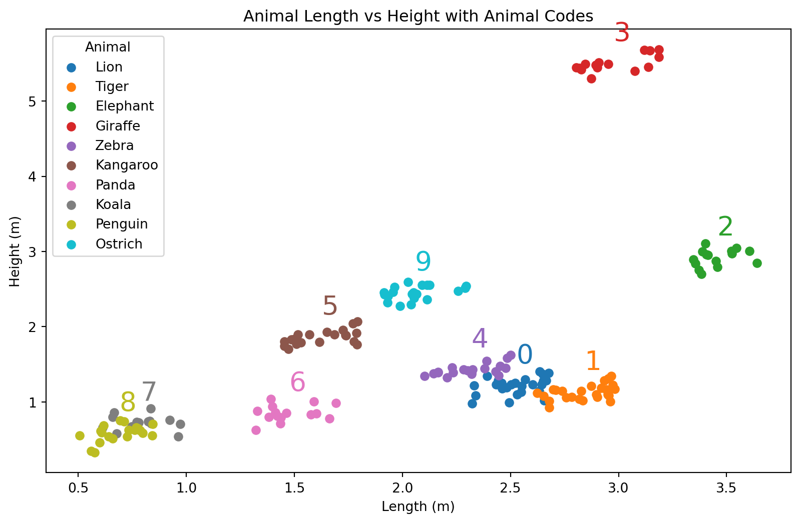
Lineær regresjon med tallkoder
# Prepare the data for linear regression
X = animal_data[['Length', 'Animal_Code']]
y = animal_data['Height']

# Create and fit the model
model = LinearRegression()
model.fit(X, y)

# Predict the heights using the model
predicted_heights = model.predict(X)

# Plot the original data and the linear regression model
plt.figure(figsize=(10, 6))
colors = plt.cm.get_cmap('tab10', len(animal_data['Animal'].unique()))

for i, animal in enumerate(animal_data['Animal'].unique()):
    subset = animal_data[animal_data['Animal'] == animal]
    plt.scatter(subset['Length'], subset['Height'], label=animal, color=colors(i))

    # Predict heights for the subset
    subset_X = subset[['Length', 'Animal_Code']]
    subset_predicted_heights = model.predict(subset_X)

    # Plot the regression line for the subset
    plt.plot(subset['Length'], subset_predicted_heights, color=colors(i))

    # Print the animal code above the average length and height
    avg_length = subset['Length'].mean()
    avg_height = subset['Height'].mean()
    plt.text(avg_length, avg_height + 0.3, f'{i}', fontsize=20, color=colors(i))

# Add labels and title
plt.title('Two Variable Linear Regression: Animal Length vs Height')
plt.xlabel('Length (m)')
plt.ylabel('Height (m)')
plt.legend(title='Animal')
plt.show()
/var/folders/qn/3_cqp_vx25v4w6yrx68654q80000gp/T/ipykernel_34101/389375858.py:14: MatplotlibDeprecationWarning: The get_cmap function was deprecated in Matplotlib 3.7 and will be removed in 3.11. Use ``matplotlib.colormaps[name]`` or ``matplotlib.colormaps.get_cmap()`` or ``pyplot.get_cmap()`` instead.
colors = plt.cm.get_cmap('tab10', len(animal_data['Animal'].unique()))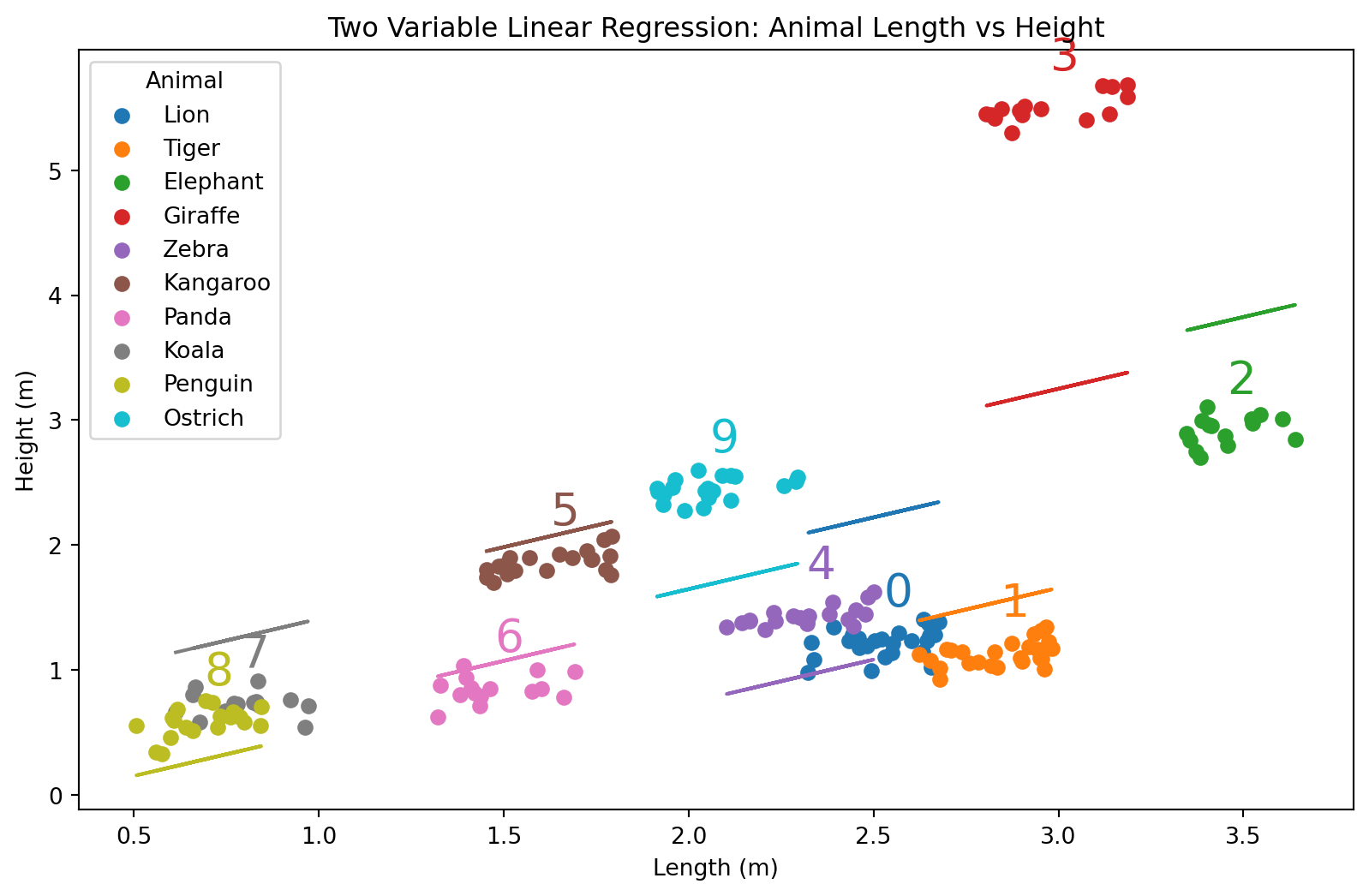
- Hvordan gikk egentlig dette? Se nøye etter.
Om vi ser på tallene, så ser vi at alle regresjonslinjene er sortert ettet tall. Det har altså noe å si hvordan dyrene er sortert. Bet blir litt rart.
Ligning
\[H(L, N) = \beta_0 + \beta_1 L + \beta_2 N\]
| Symbol | Beskrivelse |
|---|---|
| H | Høyde |
| L | Lengde |
| N | Numerisk kode for dyret |
| \(\beta_i\) | Regresjonskoeffisienter |
Hvordan gjøre det bedre?
- One-hot-encoding
Med one-hot encoding
Vi kan lage one-hot-kodet data med pandas.get_dummies(...)
from sklearn.preprocessing import OneHotEncoder
from sklearn.compose import ColumnTransformer

transformed_data = pd.get_dummies(animal_data, columns=['Animal'], drop_first=False)
display(transformed_data.sample(10))| Length | Height | Animal_Code | Animal_Elephant | Animal_Giraffe | Animal_Kangaroo | Animal_Koala | Animal_Lion | Animal_Ostrich | Animal_Panda | Animal_Penguin | Animal_Tiger | Animal_Zebra | |
|---|---|---|---|---|---|---|---|---|---|---|---|---|---|
| 38 | 2.621304 | 1.237276 | 8 | False | False | False | False | False | False | False | False | True | False |
| 72 | 3.160007 | 5.491863 | 1 | False | True | False | False | False | False | False | False | False | False |
| 106 | 1.639356 | 1.798524 | 2 | False | False | True | False | False | False | False | False | False | False |
| 28 | 2.637927 | 0.974152 | 8 | False | False | False | False | False | False | False | False | True | False |
| 64 | 3.554803 | 2.947094 | 0 | True | False | False | False | False | False | False | False | False | False |
| 81 | 2.306072 | 1.407082 | 9 | False | False | False | False | False | False | False | False | False | True |
| 122 | 1.499807 | 0.751083 | 6 | False | False | False | False | False | False | True | False | False | False |
| 99 | 2.278110 | 1.288724 | 9 | False | False | False | False | False | False | False | False | False | True |
| 151 | 0.816539 | 0.732680 | 7 | False | False | False | False | False | False | False | True | False | False |
| 115 | 1.766059 | 1.929994 | 2 | False | False | True | False | False | False | False | False | False | False |
Regresjonsmodell med one-hot-coding
X = transformed_data.drop(columns=['Height', 'Animal_Code'])
y = transformed_data['Height']

model = LinearRegression()
model.fit(X, y)

# Bruke modellen
predicted_heights = model.predict(X)

# Plot de originale dataene og den lineære regresjonsmodellen
plt.figure(figsize=(8, 5))
colors = plt.cm.get_cmap('tab10', len(animal_data['Animal'].unique()))

for i, animal in enumerate(animal_data['Animal'].unique()):
    subset = animal_data[animal_data['Animal'] == animal]
    plt.scatter(subset['Length'], subset['Height'], label=animal, color=colors(i), edgecolor=colors(i), facecolors='none')

    # Prediker høyder for hvert dyr
    subset_X = transformed_data[transformed_data[f'Animal_{animal}'] == 1].drop(columns=['Height', 'Animal_Code'])
    subset_predicted_heights = model.predict(subset_X)

    # Plot regresjonslinjen for hvert enkelt dyr
    plt.plot(subset['Length'], subset_predicted_heights, color=np.array(colors(i))*0.9, linewidth=5)

# Pynt
plt.title('Lineær regresjon med One-Hot Encoding: Dyrelengde vs Høyde')
plt.xlabel('Lengde (m)')
plt.ylabel('Høyde (m)')
plt.legend(title='Dyr')
plt.show()
/var/folders/qn/3_cqp_vx25v4w6yrx68654q80000gp/T/ipykernel_34101/1362502205.py:12: MatplotlibDeprecationWarning: The get_cmap function was deprecated in Matplotlib 3.7 and will be removed in 3.11. Use ``matplotlib.colormaps[name]`` or ``matplotlib.colormaps.get_cmap()`` or ``pyplot.get_cmap()`` instead.
colors = plt.cm.get_cmap('tab10', len(animal_data['Animal'].unique()))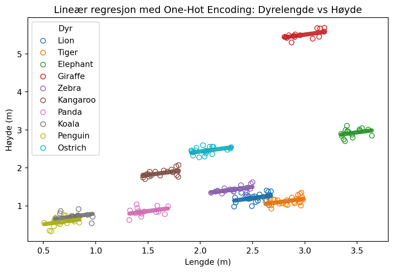
Likning
\[H(L, N) = \beta_0 + \beta_1 L + \sum_{\mathrm{i = \{Lion, Tiger, ...\}}}^{k} \beta_i [\text{er dette en }i\mathrm{?}]\]
La oss se på dette i et litt mindre datasett
import pandas as pd
import seaborn as sns
health = sns.load_dataset('healthexp')
display(health.sample(10))| Year | Country | Spending_USD | Life_Expectancy | |
|---|---|---|---|---|
| 186 | 2006 | France | 3444.855 | 81.0 |
| 192 | 2007 | France | 3588.227 | 81.2 |
| 43 | 1981 | Canada | 898.807 | 75.5 |
| 150 | 2000 | France | 2687.530 | 79.2 |
| 265 | 2019 | Great Britain | 4385.463 | 81.4 |
| 200 | 2008 | Japan | 2799.198 | 82.7 |
| 111 | 1993 | USA | 3286.558 | 75.5 |
| 268 | 2020 | Canada | 5828.324 | 81.7 |
| 52 | 1982 | USA | 1329.669 | 74.5 |
| 89 | 1990 | Canada | 1699.774 | 77.3 |
Her bruker vi seaborn kun for å laste inn et datasett. Seaborn gir oss også noen muligheter til pen visualisering i statistikk, for dem som måtte være interessert i det.
Underveisoppgave
Note
- Gjør one-hot encoding av healthexp-datasettet
- Gjør trenings-validerings-splitt av datasettet
- Tren en lineær regresjonsmodell for å predikere life expectancy, med spending som forklaringsvariabel
- Ta med land som forklaringsvariabel i modellen
- Sammenligne nøyaktigehten til modellene
import pandas as pd
import seaborn as sns
health = sns.load_dataset('healthexp')
health_onehot = pd.get_dummies(health, columns=['Country'])
display(health_onehot.sample(10))| Year | Spending_USD | Life_Expectancy | Country_Canada | Country_France | Country_Germany | Country_Great Britain | Country_Japan | Country_USA | |
|---|---|---|---|---|---|---|---|---|---|
| 218 | 2011 | 3740.756 | 82.7 | False | False | False | False | True | False |
| 221 | 2012 | 4745.546 | 80.6 | False | False | True | False | False | False |
| 185 | 2006 | 3567.061 | 79.8 | False | False | True | False | False | False |
| 202 | 2009 | 3945.873 | 80.9 | True | False | False | False | False | False |
| 46 | 1981 | 603.965 | 76.5 | False | False | False | False | True | False |
| 1 | 1970 | 192.143 | 72.2 | False | True | False | False | False | False |
| 226 | 2013 | 4428.753 | 81.7 | True | False | False | False | False | False |
| 75 | 1987 | 1480.096 | 75.6 | False | False | True | False | False | False |
| 47 | 1981 | 1191.537 | 74.1 | False | False | False | False | False | True |
| 73 | 1986 | 1847.773 | 74.7 | False | False | False | False | False | True |
for i, frame in health.groupby("Country"):
    plt.scatter(frame["Spending_USD"], frame["Life_Expectancy"], marker="o", label=i)
plt.xlabel("Expenditure (USD)")
plt.ylabel("Life expectancy")
plt.legend()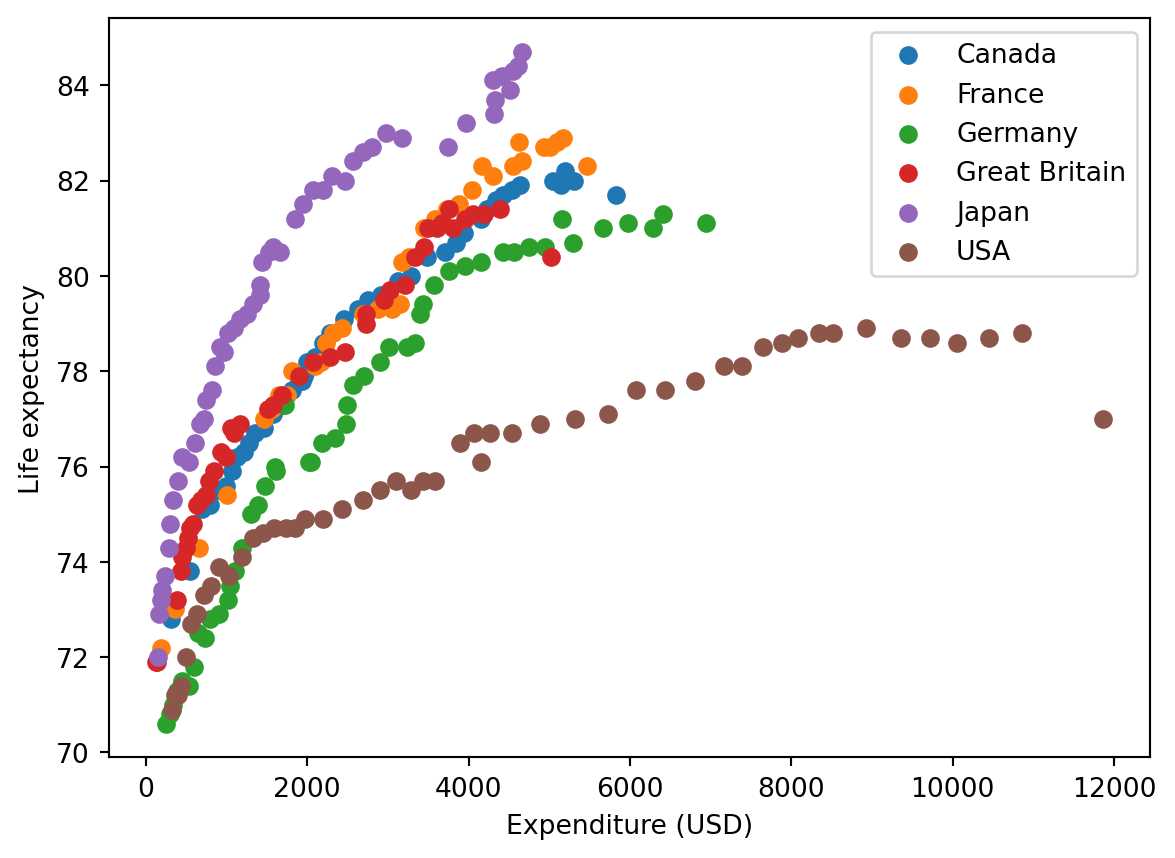
Start på løsning
health_onehot = pd.get_dummies(health, columns=['Country'], drop_first=False)
display(health.sample(10))| Year | Country | Spending_USD | Life_Expectancy | |
|---|---|---|---|---|
| 27 | 1977 | Germany | 647.352 | 72.5 |
| 255 | 2017 | USA | 10046.472 | 78.6 |
| 57 | 1983 | USA | 1451.945 | 74.6 |
| 234 | 2014 | France | 4626.679 | 82.8 |
| 122 | 1995 | Japan | 1413.445 | 79.6 |
| 121 | 1995 | Great Britain | 1094.034 | 76.7 |
| 95 | 1991 | Canada | 1805.209 | 77.6 |
| 114 | 1994 | France | 1817.042 | 78.0 |
| 105 | 1992 | USA | 3100.343 | 75.7 |
| 99 | 1991 | USA | 2901.589 | 75.5 |
Enkel regresjonsmodell
from sklearn.linear_model import LinearRegression
from sklearn.model_selection import train_test_split

X = np.array(health_onehot["Spending_USD"]).reshape(-1,1)
y = health_onehot['Life_Expectancy']

# Split the data into training and testing sets
X_train, X_test, y_train, y_test = train_test_split(X, y, test_size=0.2, random_state=42)

# Create and fit the model on the training data
model = LinearRegression()
model.fit(X_train, y_train)

# Predict the life expectancy using the model on the test data
predicted_life_expectancy = model.predict(X_test)

# Evaluate the model
from sklearn.metrics import mean_squared_error, r2_score

mse = mean_squared_error(y_test, predicted_life_expectancy)
r2 = r2_score(y_test, predicted_life_expectancy)

# Plot the original data and the linear regression model
plt.figure(figsize=(8, 5))
plt.scatter(X_test, y_test, color='blue', label='Actual Data')
plt.plot(X_test, predicted_life_expectancy, color='red', label='Linear Regression Model')

# Add labels and title
plt.title('Linear Regression: Spending vs Life Expectancy')
plt.xlabel('Spending (USD)')
plt.ylabel('Life Expectancy (years)')
plt.legend()
plt.show()
print(f'Mean Squared Error: {mse}')
print(f'R^2 Score: {r2}')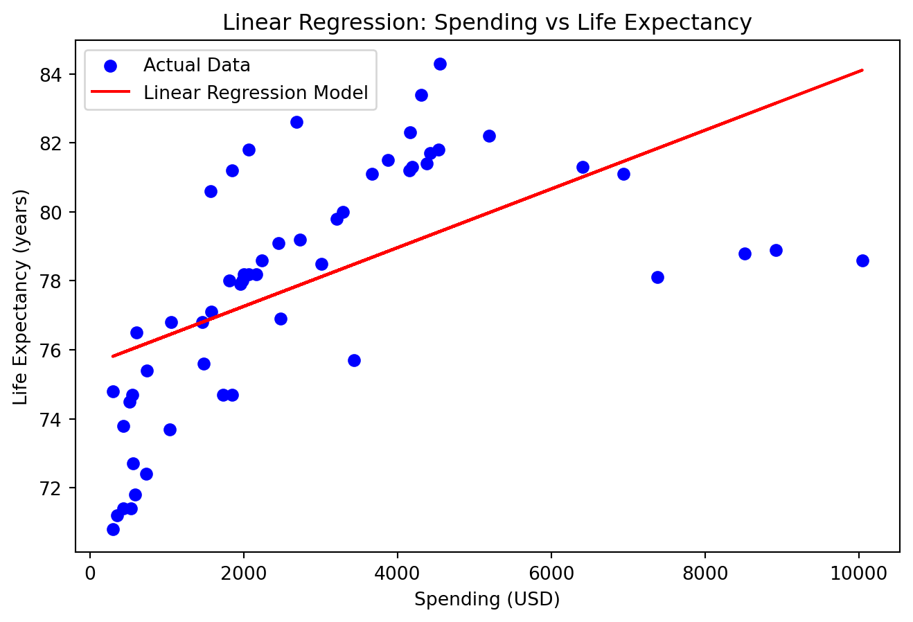
Mean Squared Error: 7.846016617615249
R^2 Score: 0.3573359515082699
En påfallende “god” modell, hva har skjedd her?
from sklearn.linear_model import LinearRegression
from sklearn.model_selection import train_test_split

X = health_onehot.drop(columns=['Life_Expectancy'])
y = health_onehot['Life_Expectancy']

# Split the data into training and testing sets
X_train, X_test, y_train, y_test = train_test_split(X, y, test_size=0.2, random_state=42)

# Create and fit the model on the training data
model = LinearRegression()
model.fit(X_train, y_train)

# Predict the life expectancy using the model on the test data
predicted_life_expectancy = model.predict(X_test)

# Evaluate the model
mse = mean_squared_error(y_test, predicted_life_expectancy)
r2 = r2_score(y_test, predicted_life_expectancy)


# Plot the original data and the linear regression model predictions per country
plt.figure(figsize=(8, 5))
colors = plt.cm.get_cmap('tab20', len(health['Country'].unique()))

for i, country in enumerate(health['Country'].unique()):
    subset = health[health['Country'] == country]
    plt.scatter(subset['Spending_USD'], subset['Life_Expectancy'], label=country, color=colors(i), edgecolor=colors(i), facecolors='none')

    # Predict life expectancy for the subset
    subset_X = health_onehot[health_onehot[f'Country_{country}'] == 1].drop(columns=['Life_Expectancy'])
    subset_predicted_life_expectancy = model.predict(subset_X)

    # Plot the regression line for the subset
    plt.plot(subset['Spending_USD'], subset_predicted_life_expectancy, color=np.array(colors(i))*0.9, linewidth=2)

# Add labels and title
plt.title('Linear Regression with One-Hot Encoding: Spending vs Life Expectancy by Country')
plt.xlabel('Spending (USD)')
plt.ylabel('Life Expectancy (years)')
plt.legend(title='Country', bbox_to_anchor=(1.05, 1), loc='upper left')
plt.show()
print(f'Mean Squared Error: {mse}')
print(f'R^2 Score: {r2}')
/var/folders/qn/3_cqp_vx25v4w6yrx68654q80000gp/T/ipykernel_34101/1590429931.py:24: MatplotlibDeprecationWarning: The get_cmap function was deprecated in Matplotlib 3.7 and will be removed in 3.11. Use ``matplotlib.colormaps[name]`` or ``matplotlib.colormaps.get_cmap()`` or ``pyplot.get_cmap()`` instead.
colors = plt.cm.get_cmap('tab20', len(health['Country'].unique()))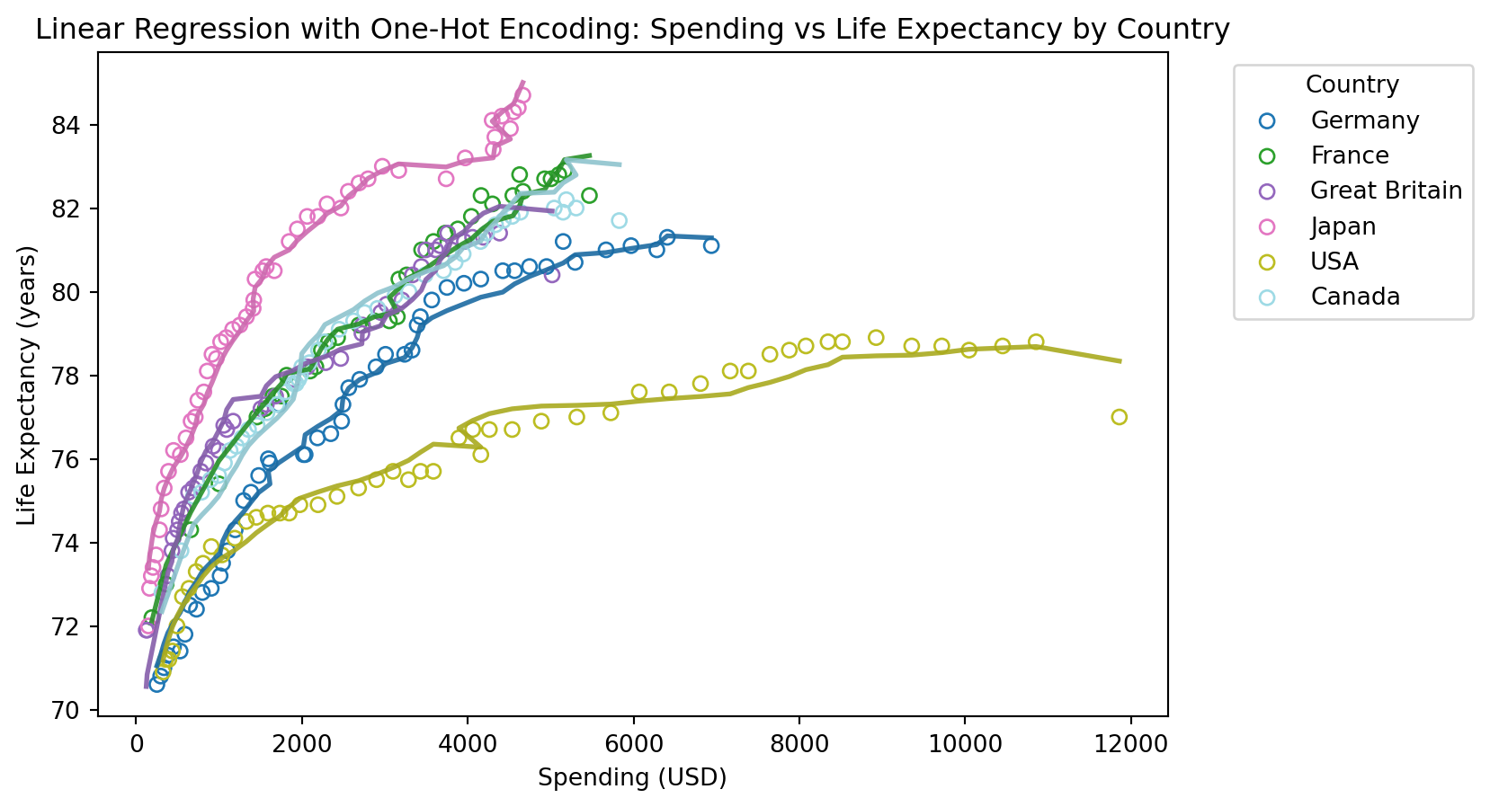
Mean Squared Error: 0.13772868450148823
R^2 Score: 0.9887186991451887
Uten år som forklaringsvariabel
# Drop the 'Year' column from the dataset
health_onehot_no_year = health_onehot.drop(columns=['Year'])

# Prepare the data for linear regression
X = health_onehot_no_year.drop(columns=['Life_Expectancy'])
y = health_onehot_no_year['Life_Expectancy']

# Split the data into training and testing sets
X_train, X_test, y_train, y_test = train_test_split(X, y, test_size=0.2, random_state=42)

# Create and fit the model on the training data
model = LinearRegression()
model.fit(X_train, y_train)

# Predict the life expectancy using the model on the test data
predicted_life_expectancy = model.predict(X_test)

# Evaluate the model
mse = mean_squared_error(y_test, predicted_life_expectancy)
r2 = r2_score(y_test, predicted_life_expectancy)

# Plot the original data and the linear regression model predictions per country
plt.figure(figsize=(8, 5))
colors = plt.cm.get_cmap('tab20', len(health['Country'].unique()))

for i, country in enumerate(health['Country'].unique()):
    subset = health[health['Country'] == country]
    plt.scatter(subset['Spending_USD'], subset['Life_Expectancy'], label=country, color=colors(i), edgecolor=colors(i), facecolors='none')

    # Predict life expectancy for the subset
    subset_X = health_onehot_no_year[health_onehot_no_year[f'Country_{country}'] == 1].drop(columns=['Life_Expectancy'])
    subset_predicted_life_expectancy = model.predict(subset_X)

    # Plot the regression line for the subset
    plt.plot(subset['Spending_USD'], subset_predicted_life_expectancy, color=np.array(colors(i))*0.9, linewidth=2)

# Add labels and title
plt.title('Linear Regression with One-Hot Encoding (No Year): Spending vs Life Expectancy by Country')
plt.xlabel('Spending (USD)')
plt.ylabel('Life Expectancy (years)')
plt.legend(title='Country', bbox_to_anchor=(1.05, 1), loc='upper left')
plt.show()
print(f'Mean Squared Error: {mse}')
print(f'R^2 Score: {r2}')
/var/folders/qn/3_cqp_vx25v4w6yrx68654q80000gp/T/ipykernel_34101/3728857717.py:24: MatplotlibDeprecationWarning: The get_cmap function was deprecated in Matplotlib 3.7 and will be removed in 3.11. Use ``matplotlib.colormaps[name]`` or ``matplotlib.colormaps.get_cmap()`` or ``pyplot.get_cmap()`` instead.
colors = plt.cm.get_cmap('tab20', len(health['Country'].unique()))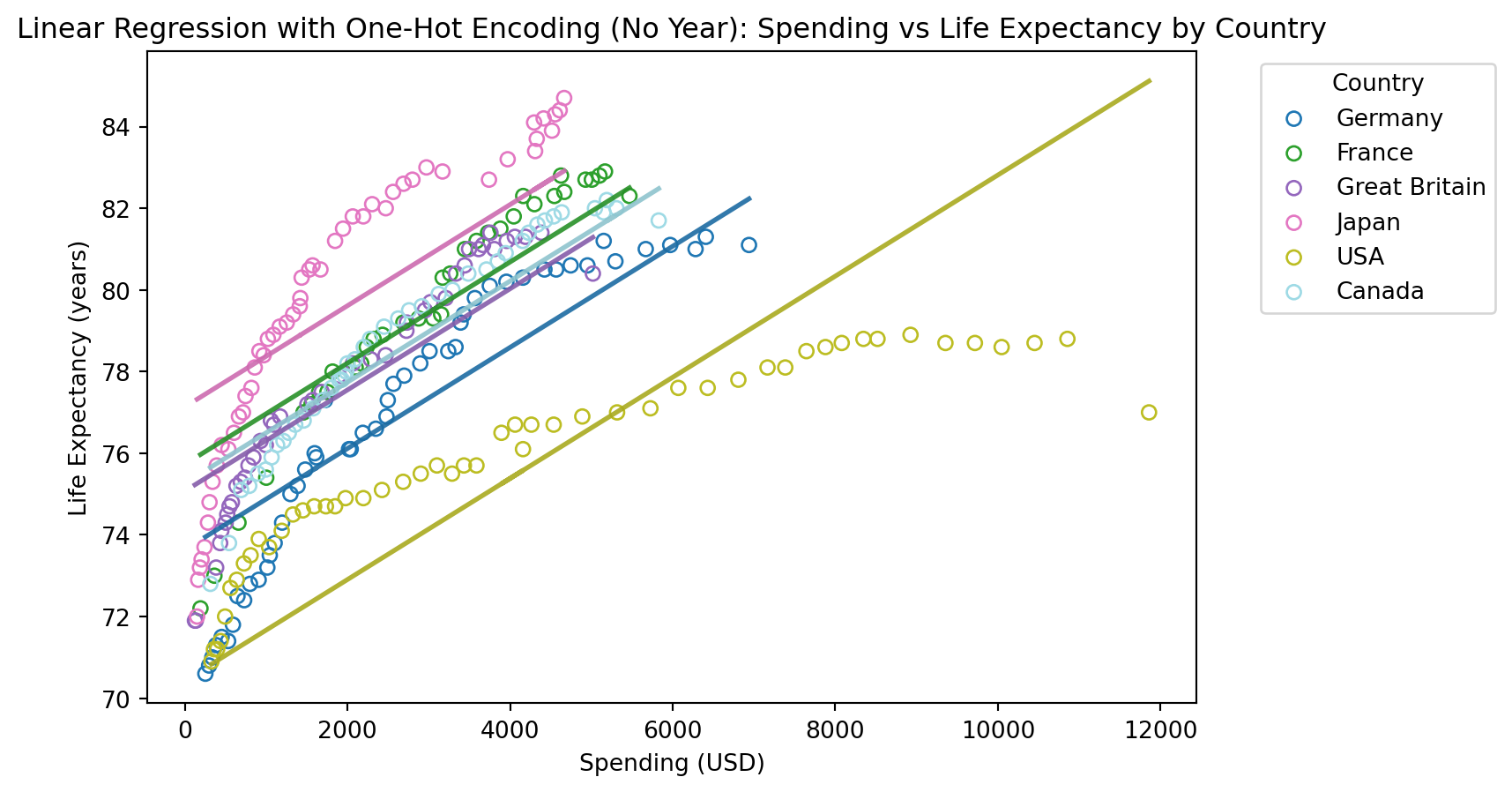
Mean Squared Error: 2.301373209783868
R^2 Score: 0.8114954509821515